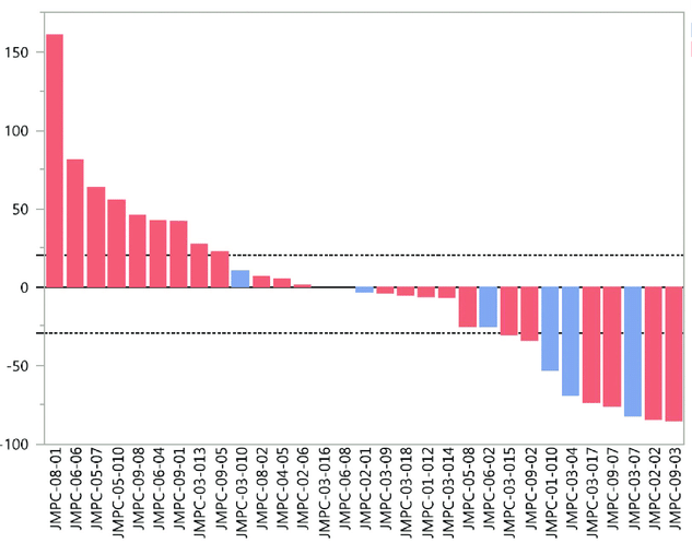
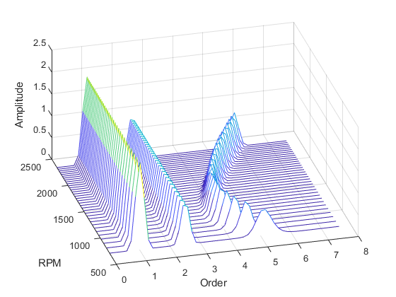
Waterfall Plot: 두 판 사이의 차이
(Created page with "'''Waterfall Plot''' is a data visualization technique used to represent sequential changes in the value of a variable, often to show the cumulative effect of positive and negative contributions over time or across categories. This plot is commonly used in fields like financial analysis, engineering, and data science to break down the components of a total change. == Overview == A waterfall plot displays data as a series of bars, where: * Each bar represents an individu...") |
편집 요약 없음 |
||
| 2번째 줄: | 2번째 줄: | ||
== Overview == | == Overview == | ||
[[File:Waterfall Plot.png|thumb|Two Dimensional Waterfall Plot]] | |||
[[File:Three Dimensional Waterfall Plot.png|thumb|Three Dimensional Waterfall Plot]] | |||
A waterfall plot displays data as a series of bars, where: | A waterfall plot displays data as a series of bars, where: | ||
* Each bar represents an individual component's contribution. | * Each bar represents an individual component's contribution. | ||
| 71번째 줄: | 73번째 줄: | ||
* [[Data Visualization]] | * [[Data Visualization]] | ||
* [[Financial Analysis]] | * [[Financial Analysis]] | ||
[[Category:Data Science]] | |||
2024년 11월 30일 (토) 07:08 기준 최신판
Waterfall Plot is a data visualization technique used to represent sequential changes in the value of a variable, often to show the cumulative effect of positive and negative contributions over time or across categories. This plot is commonly used in fields like financial analysis, engineering, and data science to break down the components of a total change.
Overview[편집 | 원본 편집]
A waterfall plot displays data as a series of bars, where:
- Each bar represents an individual component's contribution.
- Bars are color-coded to distinguish between increases (positive contributions) and decreases (negative contributions).
- The cumulative total is shown as the final bar, providing a clear view of the net effect.
The plot starts with an initial value, shows intermediate changes (additions or subtractions), and ends with a final value.
Key Features[편집 | 원본 편집]
- Sequential Representation: Visualizes how individual components contribute to a cumulative total.
- Color Coding: Differentiates between positive and negative contributions for easy interpretation.
- Cumulative Totals: Provides a clear summary of the overall change.
Applications[편집 | 원본 편집]
Waterfall plots are widely used in various domains:
- Finance:
- Break down revenue growth or profit changes into contributing factors.
- Analyze cost components and their impact on net income.
- Engineering:
- Show changes in signal strength, energy levels, or other measurements across stages.
- Data Science:
- Explain model predictions by visualizing the impact of individual features (e.g., SHAP values in machine learning).
- Project Management:
- Illustrate changes in budgets or schedules due to specific actions or events.
How to Create a Waterfall Plot[편집 | 원본 편집]
- Prepare the Data:
- Identify the starting value, individual contributions (positive and negative), and the final value.
- Choose a Visualization Tool:
- Use tools like Excel, Python libraries (e.g., Matplotlib, Plotly), or specialized software for creating waterfall plots.
- Customize the Plot:
- Add labels, titles, and color coding for clarity.
- Interpret the Results:
- Analyze how each component contributes to the cumulative change.
Example[편집 | 원본 편집]
Consider a company analyzing its net income changes over a year. The data might look like this:
| Category | Contribution |
|---|---|
| Initial Revenue | 100,000 |
| Sales Increase | +20,000 |
| Marketing Expense | -5,000 |
| Operational Costs | -15,000 |
| Final Revenue | 100,000 |
The waterfall plot will show a starting bar at 100,000, positive and negative bars for the changes, and a final bar at 100,000.
Advantages[편집 | 원본 편집]
- Helps to break down complex changes into understandable components.
- Provides a clear and concise visualization of cumulative effects.
- Enhances decision-making by identifying key contributors to changes.
Limitations[편집 | 원본 편집]
- Can become cluttered with too many categories or components.
- Interpretation depends heavily on clear labeling and color coding.
- Limited in representing non-additive relationships.

